Introduction
I had the wonderful opportunity to help build this new product from the very beginning. Designing dashboards and data visualizations was new to me, and I learned crazy amount.
We had a four-person team: Product Manager, UX/UI Designer (me), Dashboard Developer, and a Database Developer.
Our users were college bookstore directors and managers.
The goal of this product was to help our users make actionable decisions from the data and insights we displayed.
Product Overview
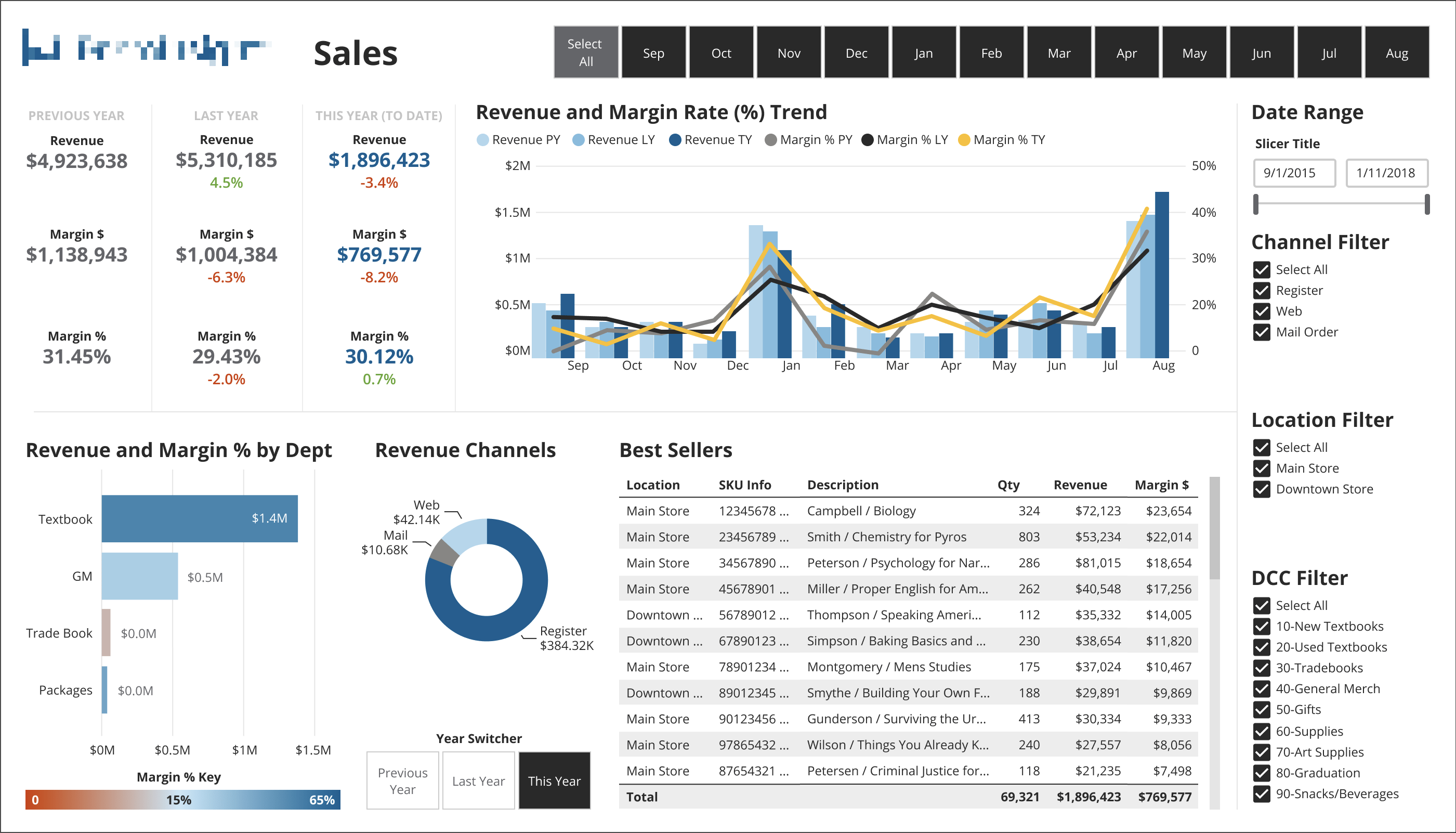
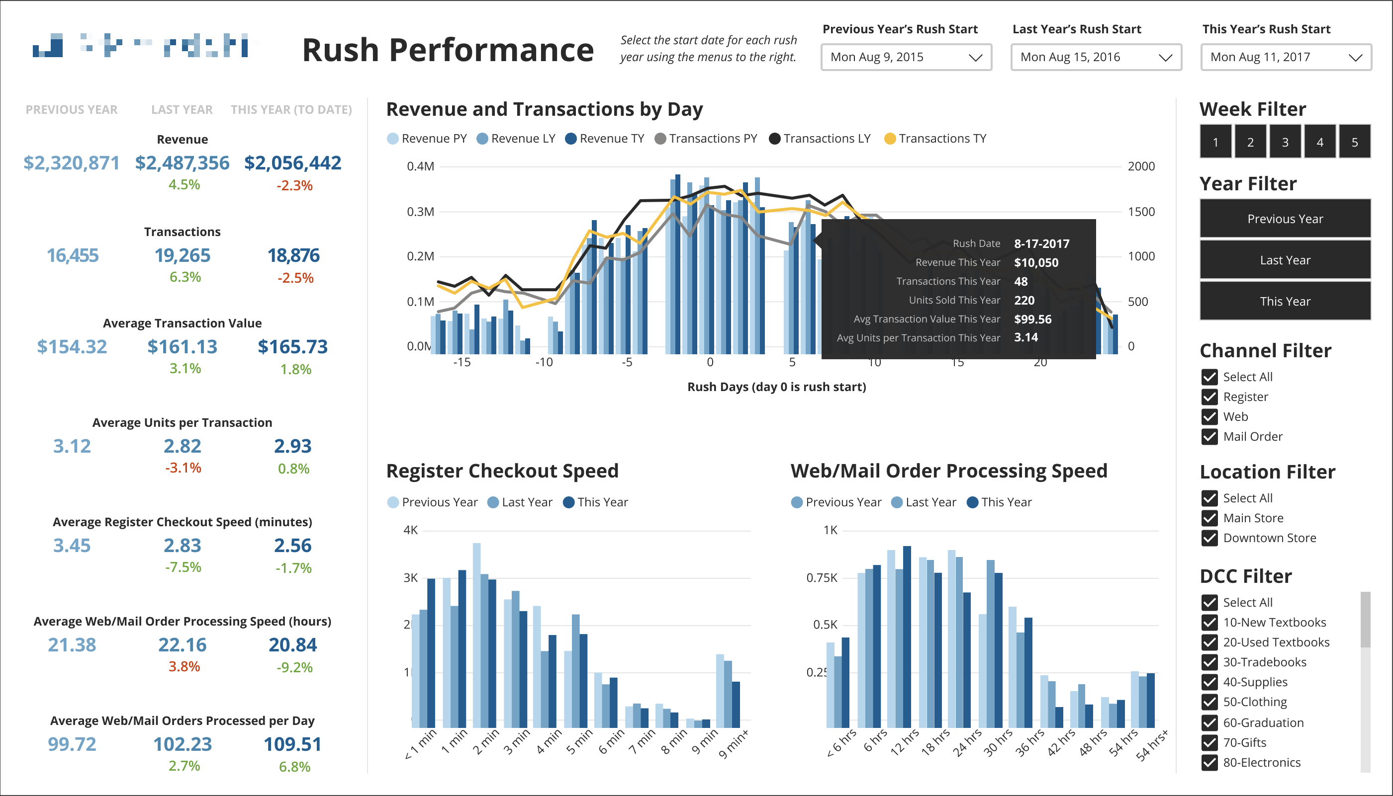
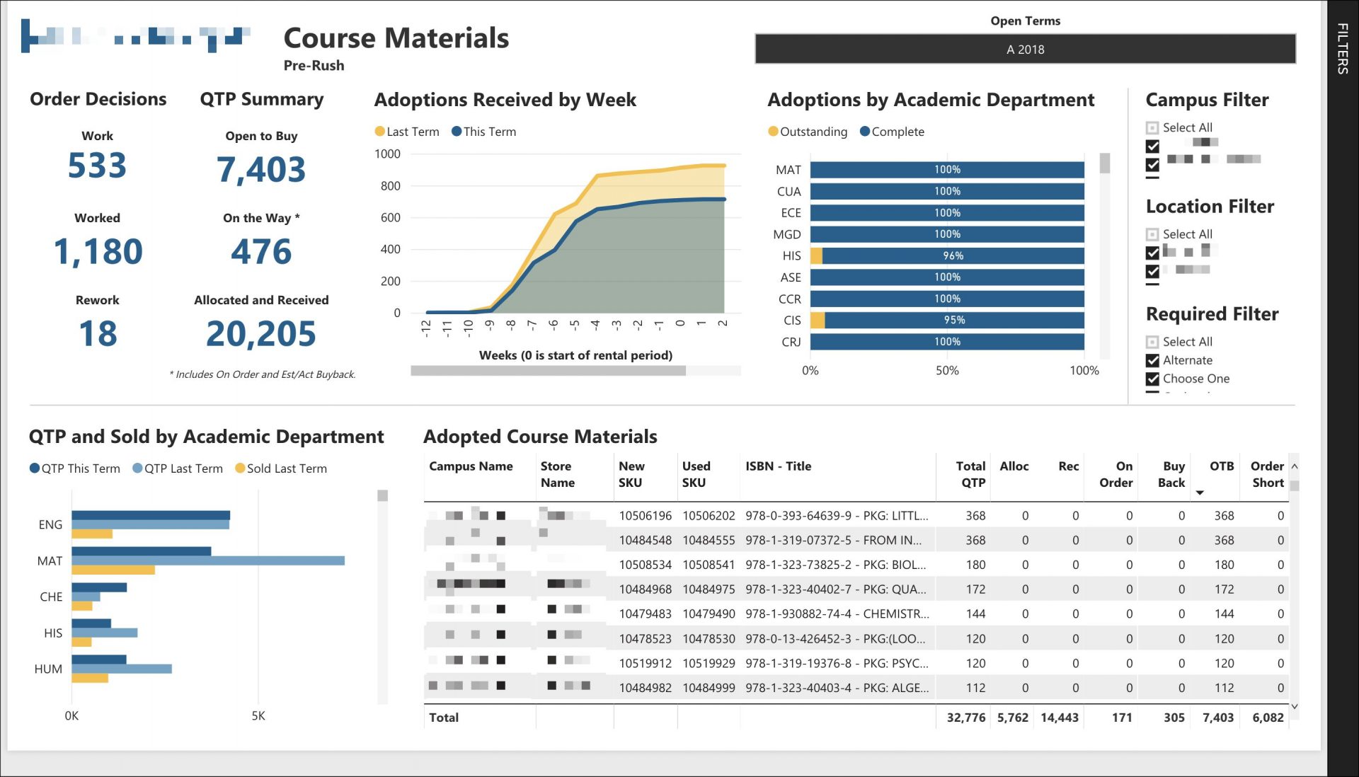
This product was part of a suite of software, specially designed to run college bookstores. It worked by taking data from our users back-office systems, performing calculations on the data, and then presenting interactive data visualizations based on industry KPIs.
The dashboards would allow users to quickly identify and monitor those KPIs. Prior to this product, users had to compile data manually by running multiple reports and doing a lot of spreadsheet work to get the numbers they needed. We would be saving hours of manual work per week for our users.
Discovery
Most of our research was conducted through user interviews with bookstore managers and directors, as well as a few industry KPI experts.
Throughout the product development process, we did multiple rounds of interviews to show new mockups and discuss important metrics.
The knowledge and feedback we gained from this research directly contributed to the success of this product.

Design
My primary role on this project was to create innovative and easy-to-digest mockups of the data visualizations. This required research into defining what visuals would or would not be appropriate for the data we were going to display. Additionally, a lot of information needed to be included in the dashboards to show correlations between visuals and the data itself, and to also surface problems (such as bad/misconfigured data).

Challenges and Constraints
Our users back-office systems had inconsistent data structures. One of the goals of the project was to create standard dashboards based on industry KPIs. Having a consistent data structure behind the scenes was critical.
Another challenge was with limitations of how certain visuals could be formatted and displayed, with the BI platform we had chosen. This meant we had to make careful choices about what data to include, and how we displayed it.
Some of our visualizations were quite complex, with many data points and factors. Designing the color palette and styles, while keeping the visuals accessible for all users, was critical. Every visualization and dashboard was tested for color contrast and readability.
Mockups vs. Actual Dashboards


Delivering Value
The product launch was one of the most successful in company history, and well received by customers.
“We needed a way to standardize reporting and with [the BI Data Visualization Product], the task was simple”
One of our users
After the initial launch, we continued to iterate on the initial dashboards, and created new ones based one customer requests.